List Layout
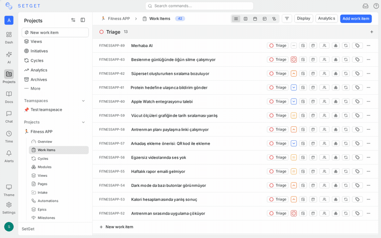
The List layout presents work items as rows in a vertical list. Each row shows the work item title along with selected property columns. It is the default layout in SetGet and the best choice when you need to scan a large number of items quickly, sort by a single property, or perform rapid inline edits.
When to use list layout
- You have dozens or hundreds of work items and need to scan titles quickly.
- You want a clean, text-dense view without visual overhead.
- You need to sort by a single column and read results top to bottom.
- You prefer keyboard-driven navigation over mouse-driven drag-and-drop.
For visual workflow management, consider Kanban. For multi-column tabular editing, see Spreadsheet.
Columns displayed
Each row in the list shows a set of property columns. The default visible columns are:
| Column | Description |
|---|---|
| Identifier | The project-prefixed ID (e.g., PROJ-42) |
| Title | The work item title, shown as the primary text |
| State | Current workflow state icon and label |
| Priority | Priority level indicator |
| Assignees | Avatar(s) of assigned members |
| Due date | Target completion date |
You can add or remove columns using the Display Properties toggle in the toolbar. Available columns include Labels, Cycle, Module, Estimate, Start Date, Created Date, and Updated Date.
Show or hide columns
- Click the Display Properties button in the view toolbar.
- Toggle each property on or off.
- Your column preferences are saved per view.
Inline property editing
You can edit most properties directly from the list without opening the work item detail:
- Click on any property cell in a row (for example, the State or Priority column).
- A dropdown, date picker, or member selector appears inline.
- Select the new value. The change is saved immediately.
Inline-editable properties include:
| Property | Edit control |
|---|---|
| State | Dropdown with available states |
| Priority | Dropdown (Urgent, High, Medium, Low, None) |
| Assignees | Member multi-select |
| Labels | Label multi-select |
| Due date | Date picker |
| Start date | Date picker |
| Estimate | Numeric input |
| Cycle | Dropdown of active/upcoming cycles |
| Module | Dropdown of project modules |
To edit the title, click on the title text. It becomes an inline text field. Press Enter to save or Escape to cancel.
Sorting
Click any column header to sort the list by that column. Click again to toggle between ascending and descending order. A small arrow indicator shows the current sort direction.
| Sort column | Ascending order | Descending order |
|---|---|---|
| Priority | None to Urgent | Urgent to None |
| State | Backlog to Done | Done to Backlog |
| Due date | Earliest first | Latest first |
| Created date | Oldest first | Newest first |
| Updated date | Least recently updated | Most recently updated |
| Manual | Custom drag order | Reverse custom order |
You can also set the sort from Display Options without clicking column headers.
Grouping in list
Grouping organizes the flat list into collapsible sections. Each section has a header showing the group value and a count of items.
Available group-by options
| Group by | Sections created |
|---|---|
| State | One section per workflow state (Backlog, Todo, In Progress, Done, Cancelled) |
| Priority | One section per priority level |
| Assignee | One section per assigned member, plus an Unassigned section |
| Label | One section per label, plus an Unlabeled section |
| Cycle | One section per cycle, plus a No Cycle section |
| Module | One section per module, plus a No Module section |
| None | No grouping; all items in a single flat list |
To set grouping:
- Click the Display Options button (or the group icon) in the toolbar.
- Select a Group by value from the dropdown.
Sub-grouping
You can apply a second level of grouping within each primary group:
- In Display Options, set a Group by value.
- Set a Sub-group by value using a different property.
For example, group by State and sub-group by Priority to see priority breakdown within each workflow state.
TIP
Sub-grouping works best with properties that have a small number of distinct values. Avoid sub-grouping by Assignee in large teams, as it creates many nested sections.
Expand and collapse groups
- Click the group header to collapse or expand all items within that group.
- Use the Collapse All / Expand All controls at the top of the list to toggle all groups at once.
- Collapsed state is remembered for your session.
Show or hide empty groups
By default, groups with zero items are hidden. To show empty groups:
- Open Display Options.
- Toggle Show empty groups on.
This is useful when you want to see all workflow states even if some states have no items.
Keyboard navigation
The List layout supports keyboard-driven navigation for fast triaging:
| Key | Action |
|---|---|
Up / Down | Move selection to the previous / next row |
Enter | Open the selected work item in the detail pane |
Escape | Close the detail pane and return to the list |
C | Create a new work item |
Space | Toggle the selection checkbox for the current row |
Ctrl + A / Cmd + A | Select all visible items |
Delete / Backspace | Delete selected items (with confirmation) |
TIP
Combine keyboard navigation with bulk actions. Select multiple rows using Shift + Up/Down, then apply a bulk property change from the toolbar.
Bulk actions in list
When one or more rows are selected (via checkbox or keyboard), a bulk action toolbar appears:
| Action | Description |
|---|---|
| Change state | Set a new state for all selected items |
| Change priority | Set a new priority for all selected items |
| Assign | Add or replace assignees on all selected items |
| Add label | Attach a label to all selected items |
| Set cycle | Move all selected items into a cycle |
| Set module | Move all selected items into a module |
| Delete | Delete all selected items (requires confirmation) |
Creating work items from the list
You can add new items without leaving the list:
- Click the + button at the bottom of any group section (or at the bottom of the ungrouped list).
- Type a title and press Enter.
- The new item inherits the group's property value. For example, if you create an item inside the "In Progress" group, its state is automatically set to In Progress.
This makes it fast to populate a specific group with new items.
Performance considerations
The List layout loads items in pages. For projects with thousands of work items, the list uses virtual scrolling to keep the interface responsive. Only the visible rows are rendered in the DOM at any time.
If you notice slow performance:
- Apply filters to reduce the number of visible items.
- Reduce the number of displayed property columns.
- Avoid sub-grouping on high-cardinality properties.
Troubleshooting
Items appear in the wrong group
Verify the item's property value matches the group. If you recently changed the grouping property, refresh the view. Items are placed into groups based on their current property values.
Inline editing dropdown does not appear
Some properties may not be editable inline if you lack permission to modify them. Verify you have Member or Admin access to the project.
Related pages
- Views Overview — Understand what views are and how to save them.
- Kanban Board — Visualize workflow with drag-and-drop columns.
- Spreadsheet Layout — Edit properties in a full tabular grid.
- Display Options — Configure grouping, ordering, and property visibility.
- Filters — Narrow down which work items appear in the list.
- Work Items Overview — Learn about work item properties and lifecycle.