Display Options
Display options control how work items are organized and presented within a view. While filters determine which items are shown, display options determine how those items are arranged — their grouping, sort order, and which properties are visible. Every layout (List, Kanban, Spreadsheet, Calendar, Gantt) shares the same display options panel.
Access display options
- Open any view or navigate to a work items list.
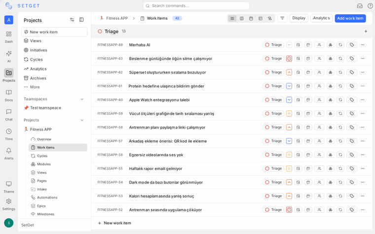
- Click the Display Options button (gear or layout icon) in the toolbar.
- The display options panel appears, showing all available settings.
Changes take effect immediately. Click outside the panel to close it.
Group by
Grouping organizes work items into sections based on a shared property value. Each unique value of the selected property becomes a group header.
Available group-by properties
| Property | Groups created | Example |
|---|---|---|
| State | One group per workflow state | Backlog, Todo, In Progress, Done, Cancelled |
| Priority | One group per priority level | Urgent, High, Medium, Low, None |
| Assignee | One group per assigned member, plus Unassigned | Alice, Bob, Unassigned |
| Label | One group per label, plus Unlabeled | Bug, Feature, Improvement, Unlabeled |
| Cycle | One group per cycle, plus No Cycle | Sprint 13, Sprint 14, No Cycle |
| Module | One group per module, plus No Module | Authentication, Payments, No Module |
| None | No grouping; all items in a flat list | (single ungrouped list) |
Set group by
- Open Display Options.
- Click the Group by dropdown.
- Select a property.
The view re-renders immediately with the new grouping.
Behavior by layout
| Layout | Grouping effect |
|---|---|
| List | Collapsible section headers between groups of rows |
| Kanban | Groups become the vertical columns |
| Spreadsheet | Collapsible section headers between groups of rows |
| Calendar | Swimlane rows for each group value |
| Gantt | Sidebar sections group items; bars align with their group row |
Sub-group by
Sub-grouping adds a second level of organization within each primary group. This creates a nested structure: primary group > sub-group > individual items.
Set sub-group by
- Open Display Options.
- Set a Group by value first.
- Click the Sub-group by dropdown.
- Select a property different from the primary group.
Effective combinations
| Group by | Sub-group by | Result |
|---|---|---|
| State | Priority | See priority distribution within each state |
| State | Assignee | See who is working on what within each state |
| Priority | State | See workflow progress for each priority level |
| Assignee | State | See each person's items organized by state |
| Module | Priority | See priority breakdown within each feature area |
| Cycle | State | See workflow status within each sprint |
WARNING
Sub-grouping is available only when a primary group is set. The sub-group property must differ from the primary group property. Avoid sub-grouping on high-cardinality properties (many distinct values), as it creates excessive nesting.
Limitations
- Sub-grouping is not available when Group by is set to None.
- The Kanban layout renders sub-groups as swimlanes within each column. More than five swimlanes can make the board difficult to read.
- The Calendar and Gantt layouts support sub-grouping but visual density increases quickly.
Order by
Ordering controls the sort sequence of work items within each group (or within the entire list if grouping is set to None).
Available order-by options
| Order by | Behavior |
|---|---|
| Manual | Items appear in the order you manually arranged them (via drag-and-drop). New items appear at the bottom. |
| Created date | Items sorted by the date they were created. |
| Updated date | Items sorted by the date they were last modified. |
| Priority | Items sorted by priority level (Urgent first by default). |
| State | Items sorted by workflow state order. |
Set order by
- Open Display Options.
- Click the Order by dropdown.
- Select a sort property.
Ascending and descending
The Direction control toggles between ascending and descending order for the selected sort property.
| Order by | Ascending | Descending |
|---|---|---|
| Manual | Custom order as arranged | Reverse of custom order |
| Created date | Oldest first | Newest first |
| Updated date | Least recently updated | Most recently updated |
| Priority | None to Urgent | Urgent to None |
| State | Backlog to Cancelled (following state order) | Cancelled to Backlog |
Set direction
- Open Display Options.
- Click the ascending/descending toggle next to the Order by dropdown.
TIP
For most workflows, "Priority descending" (Urgent first) and "Created date descending" (newest first) are the most useful default sorts.
Show or hide empty groups
When grouping is active, some group values may have zero matching items. By default, empty groups are hidden to save space.
Enable empty groups
- Open Display Options.
- Toggle Show empty groups on.
When to show empty groups
| Scenario | Recommendation |
|---|---|
| You want to see all workflow states even if some are empty | Show empty groups |
| You want a compact view with only relevant groups | Hide empty groups |
| You are using Kanban and need all columns visible for drag targets | Show empty groups |
| You have many labels but only a few are in use | Hide empty groups |
On the Kanban board, showing empty groups ensures every column is visible as a drop target, even if it currently has no cards.
Display properties
Display properties control which work item fields are visible in the current layout. This is separate from filtering — display properties affect what you see on each item, not which items are shown.
Available display properties
| Property | Default visibility | Available in |
|---|---|---|
| Identifier | Shown | All layouts |
| State | Shown | All layouts |
| Priority | Shown | All layouts |
| Assignees | Shown | All layouts |
| Labels | Hidden | All layouts |
| Due date | Shown | All layouts |
| Start date | Hidden | All layouts |
| Estimate | Hidden | All layouts |
| Cycle | Hidden | All layouts |
| Module | Hidden | All layouts |
| Created date | Hidden | Spreadsheet, List |
| Updated date | Hidden | Spreadsheet, List |
| Created by | Hidden | Spreadsheet, List |
Toggle display properties
- Click the Display Properties button in the toolbar.
- Toggle each property on or off using the checkboxes.
- The view updates immediately.
Layout-specific behavior
| Layout | How display properties appear |
|---|---|
| List | Each toggled property appears as a column in the row |
| Kanban | Each toggled property appears as a field on the card |
| Spreadsheet | Each toggled property becomes a column in the grid |
| Calendar | Toggled properties appear as secondary text on calendar chips |
| Gantt | Toggled properties appear in the sidebar list next to the item title |
TIP
Show fewer properties for a cleaner view. Show more properties when you need to compare metadata across items without opening each one. The Spreadsheet layout is designed for maximum property visibility.
Save display options
Display options are saved as part of the view configuration:
| Scenario | Persistence |
|---|---|
| Custom saved view | Display options persist for everyone using the view. Click Update View to save changes. |
| Default view | Your personal display option changes are session-local and reset when you navigate away. |
| Unsaved configuration | Changes are lost on page refresh. Save as a view to persist. |
Display options reference table
| Setting | Options | Default |
|---|---|---|
| Group by | State, Priority, Assignee, Label, Cycle, Module, None | State |
| Sub-group by | State, Priority, Assignee, Label, Cycle, Module (must differ from Group by) | None |
| Order by | Manual, Created date, Updated date, Priority, State | Manual |
| Direction | Ascending, Descending | Ascending |
| Show empty groups | On, Off | Off |
| Display properties | Toggle each property individually | Identifier, State, Priority, Assignees, Due date |
Related pages
- Views Overview — Save display options as part of reusable views.
- Filters — Control which items appear (display options control how they appear).
- SetGet Query Language — Advanced text-based filtering.
- List Layout — See how display options affect the list view.
- Kanban Board — See how grouping drives Kanban columns.
- Spreadsheet Layout — Maximum property visibility in a grid.
- Calendar Layout — Date-oriented display with color coding.
- Gantt Chart — Timeline view with grouped sidebar.